Creating your own spatial analysis maps as shapefiles with QGIS
Spatial analysis is common in modern epidemiology. I've done a fair amount correlating infectious disease outbreaks by geography. Yet these analyses have always utilized maps and geographic areas that were either built into software (e.g., the maps package in R) or readable using shapefile data from the Census bureau.
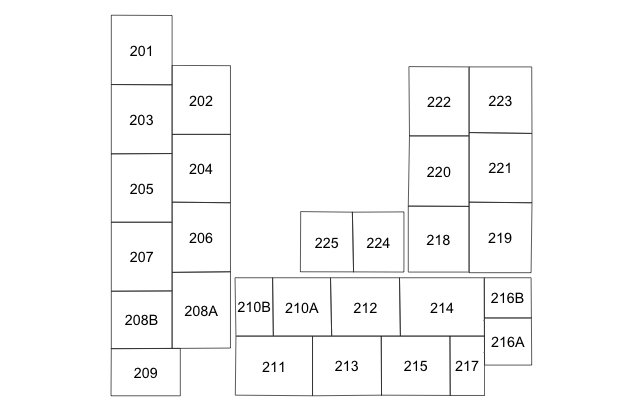
Recently I was tasked with correlating sepsis in the neonatal intensive care unit (NICU) by bed space. Clearly there was no map of the NICU already available, so this blog post is more-or-less a tutorial on how to create your own spatial analysis maps as shapefiles using the open-source geographic information system software, QGIS. It also serves as a memory aid to me so I remember how I created these maps!

QGIS incorporates a nice overview of GIS and a series of tutorials (Go to Help > Help Contents to get started). For this project, my primary interest was to create vector data for our NICU, which is a way of representing the floorplan of the unit by a series of polygon coordinates. Within the polygons that represent the actual beds and floor plans, are attributes describing, in this case, the bed numbers. The bed numbers are needed to subsequently link the infants diagnosed with sepsis to their beds in the NICU. And these data need to be saved as a shapefile, which is a common GIS format that is usable by R for mapping and spatial analyses. The first step is to create an empty shapefile in QGIS, by creating a new layer in a new project. Specify it is a polygon layer. We'll have two attributes on this layer, including the default "id" which will be a numeric index of the beds, and a text string called "bed" which will be the actual bed number (in this NICU bed numbers are suffixed with A,B,C hence the need for a text string). The only other option left to choose is the coordinate reference system (CRS), which seems to be one of the most complicated (and misunderstood) topics in GIS, especially when creating your own map that is not a typical geographic area. A quick tangent is necessary. The CRS relates your map to its representation in reality (where it exists on the earth). As an example of this confusion, see these three questions on StackExchange that ask similar questions but receive different answers (answer #1, answer #2, answer #3). There are three recommendations for the CRS from these posts that are candidates: 1) World azimuthal equidistant (EPSG:54032), 2) WGS 84 / World mercator (EPSG:3395), and 3) StatePlane_XXX (depending on your state).
Here's what I can glean from this debate, but caveat, I am no expert here. If you do not intend to project this on an actual map, then the CRS is probably irrelevant. Ok, fine, the NICU I am creating will never be placed on an actual map of the state (or city) where I reside. But what about the statistical analysis, will that be affected by choosing the wrong CRS? In the simplest case of assessing a non-random distribution of sepsis cases by bed space throughout the NICU, then no, the location of the bed does not matter. All we're concerned with is whether each bed has approximately the same number of cases of sepsis. But how about spatial autocorrelation, such as Moran's I, where location does matter relative to your neighbors? The neighbor definition may be based on contiguity or distance between the centroids of the areas. Contiguity will not be affected by the CRS, but the distance between centroids will matter (as CRS will determine the scaling). Yet this is not so much a concern over the specific CRS used, but the scaling of the map produced. I brought this same question to my institution's GIS expert and was advised to "use a projected coordinate system rather than a geographic coordinate system (Latitude/Longitude)," and if possible represent the geography of where this NICU is located. Therefore my take home point is to select a projected coordinate system of my locale, know the scaling of your map, and therefore if you choose to define neighbors based on centroid distance, you can appropriately specify the critical threshold. I chose the NAD_1983_StatePlane_Delaware_FIPS_0700_Feet (where the NICU is located).
After the shapefile layer is added with associated attributes, and the CRS set as needed, the next step is to add an image file (i.e., scan of the NICU map) as a raster layer. Specify the same CRS as you did for the shapefile layer to ensure consistency. If the scan does not initially show in the viewer, the zoom level needs to be adjusted. I suspect this is because the only information contained in the image file is the resolution, therefore the scaling and zoom gets adjusted automatically depending on the CRS. To start tracing the map into the shapefile layer, we first toggle editing, then select the add feature tool. However, before drawing the map, one final option to set is the snapping options. This will ensure that there are no topology errors, such as undershoots, overshoots, and slivers. I selected to snap to both the vertex and segment using a tolerance of 10 pixels. Now we're ready to draw each bed space using the add feature tool, assigning the id and bed attributes to the space. Ensure that each area is contiguous to the other areas (the snapping option should control this).
After the entire map is drawn and attributes assigned, save the layer edits into the shapefile, and the overall QGIS project to a project file. We're almost ready for the spatial analysis, but first, let's return one last time to the CRS. As mentioned in the brief tangent that I took earlier, the CRS may be needed if you're done a spatial autocorrelation and defining neighbors by centroid distance. If so, you'll need to know the scale of your map and the features within. QGIS contains a measure line tool. I took a few measurements of the overall width and height, as well as some feature specific measurements, and printed a hard copy of the map. Because I choose a CRS based on feet, the measurements are in feet. I also recorded the (X,Y) coordinates of the top left & right and bottom left & right corners to facilitate plotting in R.
Finally, with the shapefile layer created, we're ready to read it into R (or the statistical software of your choice) for the spatial analysis. The code to do this is relatively straightforward and included below to demonstrate reading and plotting the map.

Sample codes in R
Reading shapefiles
library(maptools)
Read the shapefile into R
map = readShapePoly("Path/to/shapefile/shapefile_name_without_extension", proj4string=CRS("+proj=tmerc +lat_0=38 +lon_0=-75.41666666666667 +k=0.999995 +x_0=200000.0001016002 +y_0=0 +ellps=GRS80 +datum=NAD83 +to_meter=0.3048006096012192 +no_defs"))
Note: to obtain the proj4 string defining the CRS, copy and paste the contents of your shapefile.prj file to http://www.prj2epsg.org/search. Then, go to http://spatialreference.org and search for the EPSG number returned from the previous results. Clicking the proj4 link will obtain the correct string.
Get attribute "bed" from the shapefile
bed_list = as.character(slot(map, "data")$bed)
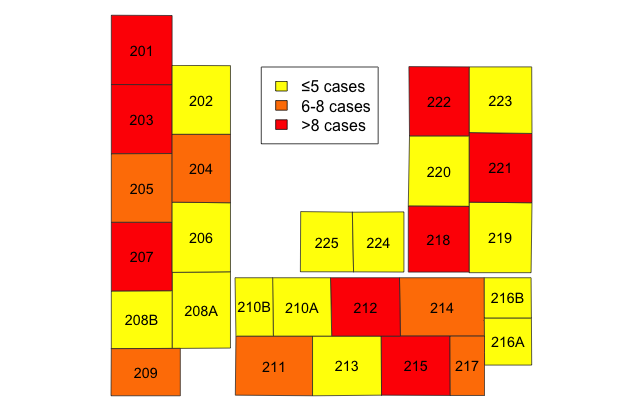
Based upon the order of the beds in bed_list, you can now tally the outcomes by the feature. Then we can assign colors, say by quintile, to the various areas to visually depict gradients in outcomes.
Plot map with color densities
plot(map, border="#333333", col=)
Apply attribute labels to the center of each geographic feature
text(t(sapply(slot(map, "polygons"), function(i) slot(i, "labpt"))), cex=0.9, labels=bed_list)
Edit: The plotting functions above are manually creating a choropleth map. For a more streamlined and visually pleasing figure, see this article in Spatial Demography.
Cite: Goldstein ND. Creating your own spatial analysis maps as shapefiles with QGIS. Oct 13, 2016. DOI: 10.17918/goldsteinepi.
