Novel methods of public health communication
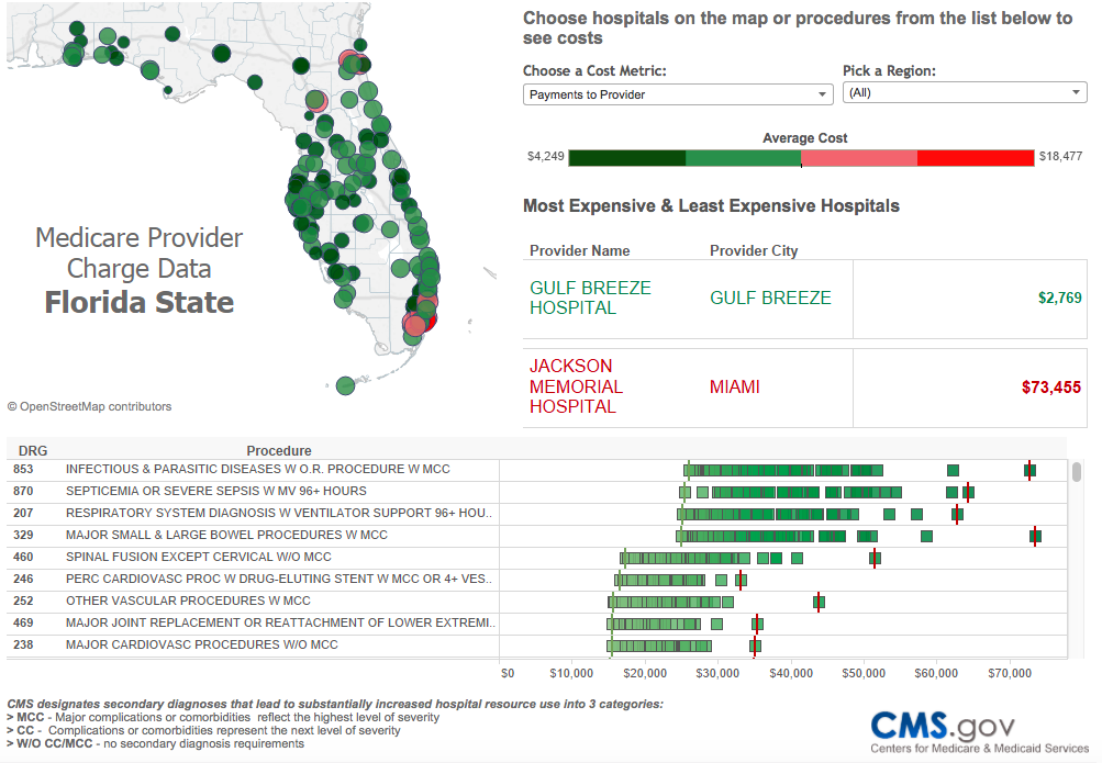
This short blog post calls attention to two newer mediums for communicating health data. As you know, presentation of data in terms of figures and tables is commonplace in traditional public health communications, yet these are static visuals. They do not allow the data consumer to interact with the data, such as exploring population stratifications and how they may impact the results and quality measures. By moving towards interactive, non-static representation of the data, consumers will be able to ask real-time questions instead of relying on a few power users to update the results and re-rerun the analyses. Questions such as "How does adherence to this quality measure change when only applied towards women?" or "only applied to people in a certain age range?" or "with a certain comorbidity?" will be a figurative mouse-click away. The question may no longer be "what is most statistically significant?" but rather "what is of biggest interest to your audience?"

These kinds of questions can potentially be answered with a new suite of data visualization tools that are becoming commonplace in quality, performance, and process improvement; and policy and planning activities. These tools create data visualization dashboards (screenshot above) that provide a snapshot or longitudinal view of high dimensional aggregate data using various types of graphics and plots. While the level of coding and programming necessary to produce these dashboards is likely not available to most health researchers or clinicians, software is available such as Tableau (Tableau Software, Seattle, WA) that will automate the process. Further, the utility of these dashboards to analytic epidemiology remain to be seen: presentation of healthcare data at an aggregate level provides weak evidence for causal relationships at an individual level.
Second, the use of information graphics (aka infographics) for public health interventions has evolved in recent years with the availability of free software to create the infographic and the ubiquity of social media. Infographics are an effective way to convey complex health related data through graphic form (screenshot below). In fact, major public health organizations and government entities such as the American Public Health Association and the Centers for Disease Control and Prevention have produced publicly available infographics to promote interventions that have been repeatedly demonstrated through research. As the CDC states, strategic use of infographics is of greatest benefit "when the message is more visual in nature and requires more than data or charts to communicate successfully to the target audience." Ultimately, the researcher needs to consider who their audience is, what the core message is to promote, and how to best achieve it.

Cite: Goldstein ND. Novel methods of public health communication. Mar 4, 2016. DOI: 10.17918/goldsteinepi.
