Spatial analysis for infectious disease epidemiology using R: Part 1
Readers of this blog may recall a recent post where I walked through creating a shapefile representation of a neonatal intensive care unit. The purpose of this exercise was to assess for spatial correlates of infection in the unit. In this blog post I would like to present an exploratory analysis of the data. There are two overarching questions to be asked of the data: 1) are the infections distributed in some non-random fashion in the unit, and 2) does proximity to an infection influence one's own risk? These questions can be answered using multilevel and spatial techniques.
This post is partitioned into three sections (covered in two Parts) that correspond to what I believe a natural progression of analysis. To start we will construct a visual representation of the data using choropleth maps and qualitatively assess spatial patterns. Then we will address the simple question of non-randomness to distribution of infections. Provided we find this to be the case (spoiler, they are not random) we will finally examine neighboring influences, a true spatial analysis. Code examples are interspersed throughout using R. A lot of this work is based upon this excelling tutorial series by Corey Sparks (Part 1, Part 2, Part 3).
The data for these questions are two-level. At the first level are individual patient observations. For each observation we know characteristics of the neonate as well as what bed space they were assigned to. While neonates may switch beds during their stay, one initial assumption is that the longest time in a bed represents the best point to assess for infection. We have a retrospective cohort comprising about 10 years worth of data, and therefore the second level is the clustering at a bed level. This clustering is hypothesized to violate the independence assumption in typical regressions, therefore we need to employ multilevel techniques, as I have previously blogged about here and here.
Visual representation
A choropleth map is a slick visualization tool that uses gradients of color to depict burden of disease in a geographic region. You see these maps used all the time in public health, such as during disease epidemics to depict particularly affected areas. In order to examine the data visually requires a digital representation of the geographic area. For most public health uses, R includes standard geographies in the maps package. For this particular project I had to create a map using GIS software - I chose to do this in the commonly used format of a shapefile, as detailed previously on this blog.
To plot data on the map requires a data frame representation of the clustering/plotting unit: the bed. Therefore we need to convert from the data in the long format of one observation per patient to a wide format of one observation per bed. For each bed observation we need the outcome we want plotted. One option may be a simple tally of the number of infections in that bed. This crude measure can provide an overall idea of burden of infections in an area but is not adjusted for any potentially important factors, such as the number of patients admitted to a particularly bed. Therefore it may be prudent to use as the outcome the proportion of infections given the number of patients who stayed in that bed. This can still be viewed as a crude, unadjusted outcome prone to confounding.
Assuming we have this wide format correctly created (in an object called Patient_data) we need to merge these patient data to the shapefile data. Coding-wise, it's pretty easy but let's examine it in more detail:
NICU_map = merge(x=NICU_map, y=Patient_data, by="bed", all.x=T)
NICU_map is the shapefile representation of the neonatal ICU, read into R as detailed previously. The shapefile contains a dataframe with the geographic features' attributes (NICU_map@data). To these data, we want to add the outcome data. We'll do this by merging the Patient_data dataframe with NICU_map dataframe by bed number. We do not manipulate the NICU_map dataframe (NICU_map@data) directly; it is handled by the merge function in the sp package, therefore before executing this command, be sure that the sp library is loaded.
Next we can use the spplot command to create the choropleth map. Again the code is fairly straightforward but requires some explanation:
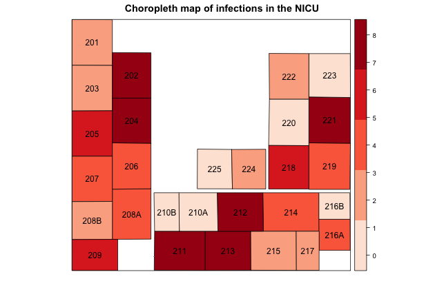
spplot(NICU_map, "Infections", cuts=4, sp.layout=list("sp.text", coordinates(NICU_map), NICU_map$bed), col.regions=brewer.pal(5, "Reds"), main="Choropleth map of infections in the NICU")
As before, NICU_map is the shapefile representation of the NICU, but now with the outcome data (i.e., "Infections" variable) added into the dataframe. We use cuts to tell the plotting function we want 4 cut points, or 5 levels of color shading (colors are defined in col.regions). As an aside, there is also an argument called at that sounds similar in operation but has an important caveat: the range provided needs to be outside the bounds of actual data. For example, if I have a range of infections from 1 to 10, and I specified quartiles of colors, I need to provide a lower bound of 0 and an upper bound of 11. The final option, sp.layout, instructs the plotting function to place the value in the bed variable (literally the bed number) in the central point of each geography on the map to ease identification. The resulting map may look something like this:

Upon visual inspection the data appear to be non-randomly distributed, with certain hot spots, but it's tough to say definitively. Further we may wonder whether patients with infections in bed 202 are influencing the risk of infections in bed 204, both shaded the darkest color on the map indicating a large number of infections. We now need to perform some statistical testing, covered in Part 2 in a subsequent post.
...continue to Part 2...
Cite: Goldstein ND. Spatial analysis for infectious disease epidemiology using R: Part 1. Jan 2, 2017. DOI: 10.17918/goldsteinepi.
